| Entrance | Mainstreet | Wiki | Register |
|
# of watchers: 11
| D20: 19 |
| Wiki-page rating |  Stumble! Stumble! |
| Informative: | 0 |
| Artistic: | 0 |
| Funny-rating: | 0 |
| Friendly: | 0 |


2010-10-12 [Eyonic]: aww thank you! I simply love da trolls mon!
2010-10-12 [The Dizzy Raven]: ^_^ no problem
2010-10-21 [Eyonic]: wip
2010-10-21 [Chel.]: Very awesome start! Might I suggest something? Instead of shading with merely a darker tone of the color you are on, try using a different color. Same goes for the highlight. For example, instead of using white/pink to shade the red hair, try yellow? Instead of using a darker peach for the skin shadows, try something like purple. :3
2010-10-21 [NOOOPE]: Going off of what Chel said,
if you are ever fortunate enough to take a figure painting class, you will learn some amazing things about skin. Most startlingly, there is a LOT of green, purple, yellow and blue in skin. Take a look at these for example:
http://theohho
http://theohho
A funny thing about shadows is they are usually the compliment color of the object they are shadowing. The darker areas of a yellow object will have a slight purple tone, where an orange will have hints of blue.
Since we think of human skin in terms of reds, peaches and pinks, a lot of green, blue and purple show up.
Also, there are different layers of skin to consider, like the more sallow skin around our eyelids, the flushed skin of the cheeks, nose, earlobes and mouth, and the thin mostly bloodless skin of the forehead.
Also, lighting is important. Considering if the light is a cold bluish light like a florescent bulb or a warm golden light like a desk lamp. Lighting can bring out interesting colors in the skin and hair and also suggest a time of day or setting.
So yes... think about using complimentary colors, up the lighting and therefore contrast within the piece and consider the setting.
2010-10-21 [Chel.]: *high five to M* YAY ART SCHOOL!
2010-10-21 [The Dizzy Raven]: I love the horns and the red eyes :D
2010-10-21 [Ravendust]: very neat :) he's a bit... fuzzy to look at though :-/ not sure how else to explain that one...
2010-10-21 [Falx]: I agree with Raven. He seems a bit... blurred around the edges maybe? It could just be the white background with the pale skin causing it to look that way.
2010-10-21 [The Dizzy Raven]: I feel silly. ^^' What does WIP mean?
2010-10-21 [The Dizzy Raven]: XD Is it "Work In Progress"?
2010-10-22 [NOOOPE]: Indeed it is
2010-10-22 [The Dizzy Raven]: Now I feel stupid XD thanks, M
2010-10-22 [Eyonic]: holy balls i leave this for one day and i get this many comments?! awesome! Thanks for the stuff about different colors and yes, it is blurry around the edges haven't gotten to fix that yet :P
2010-10-22 [pegasus1000]: I would add something but everything I would say has been... M just gave me a great art idea, we'll see if it works.
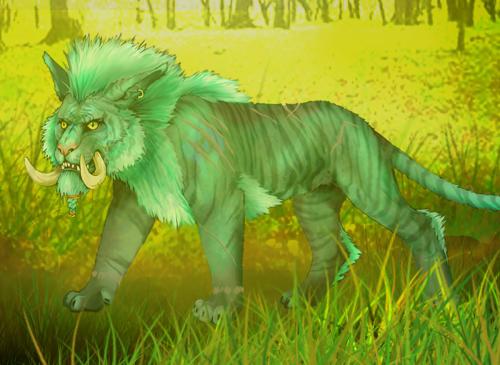
2010-10-25 [Eyonic]: randomly new thing
2010-10-26 [Chel.]: Tone back the background so the creature stands out more. ;)
2010-10-27 [Chel.]: Oh and upload it larger so we can see that lovely detail! :3
2010-10-27 [Pnelma Tirian]: haha, what an awesome monster! Higher res! Higher res! :D
2010-10-27 [Eyonic]: i can try to make it bigger, but it might make it really pixly
| Show these comments on your site |
|
Elftown - Wiki, forums, community and friendship.
|